How to Decorate with Very Peri, 2022 Color of the Year

(Image Credit: Getty Images – Image Credit: Manuta)
This color has magical qualities that you’ll definitely want to bring into your home.
At first glance, you’re probably wondering what’s so special about this color of bluish-purple? It’s lovely enough, sure, but it’s nothing to write home about…right?
Wrong, my friend. This color, named Very Peri (because it’s very-periwinkley) is fresh out of the lab where specially qualified Pantone Colorologist-Scientist-Inventors have been hard at work creating a brand new, never-before-seen color that meets 2022’s turbulent energy. This color had to be ready to hop on an important Zoom call with only a moment’s notice and still look fabulous because apparently our cameras still need to be on this year.
So, Why Very Peri?
Very Peri is a newly created periwinkle blue with violet-red undertones, inspired by the “glowing screens of our digital world,” according to Pantone when they revealed this as the Color of the Year 2022. This hue of periwinkle incorporates the best of qualities from the blue and violet families, making the color calming, yet with an energetic zest to perk it up.
Award-winning luxury interior designer Lucy Penfield affirms that “For the artist in all of us, Very Peri is the quintessential reverie, an escape from the everyday.” Sign us up for that!
With its softer hue, Very Peri is mild enough to be utilized in a monochromatic palette, or used to anchor more vibrant colors such as greens and oranges, or will be complimentary when paired with blues and neutrals.
Periwinkle, named after the flower, is an innocent, serene color that can gently carry you away into a pleasant daydream. According to color psychology, this is no surprise, as blues are known for their calming effects, and periwinkle is specifically known for prompting creativity and peacefulness.
(Inspo Image Credit - Pantone)
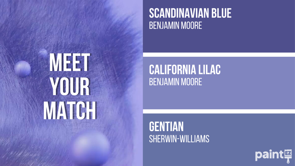
Meet Your Match
Because Very Peri is literally a brand new color, you probably won’t find an exact match in the paint swatch section at the hardware store. However, it is considerably close to Scandinavian Blue, California Lilac, and Gentian.
(Image credit - Pantone)
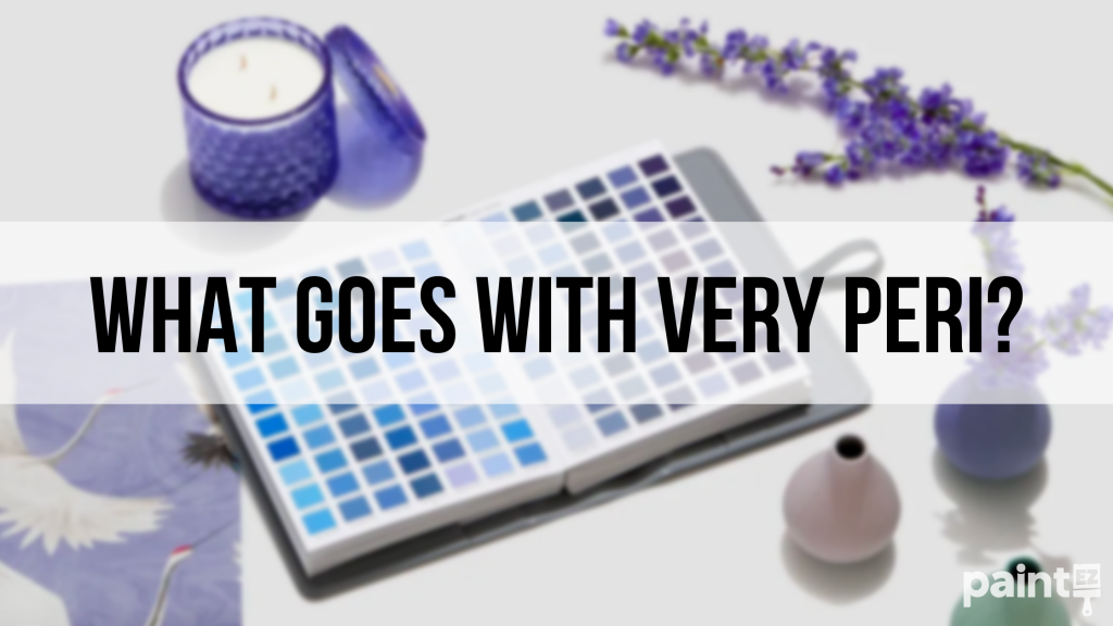
What Colors Go Well With Very Peri?
To make the ultimate Very Peri Pair, the colors you choose can magnify the magical properties of this specific periwinkle. Whether you’re looking to evoke soft tranquility, playing up a spunky flirtatious space, or keeping things sophisticated, this is an ultra-versatile supercolor that’s got your back.
We even made you a Color Cheat Sheet to get you inspired at the possibilities!
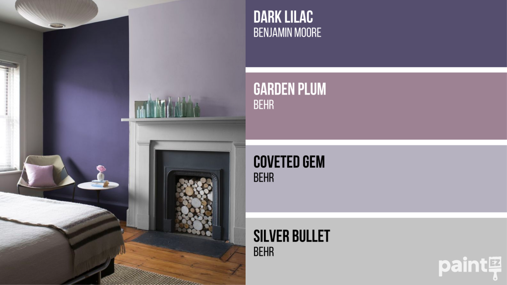
(Inspo Image Credit - Aura Matte Dark Lilac and Aura Matte Lavender Mist, Benjamin Moore)
Very Peri + Mauve & Lavender
This beautifully feminine palette of purple tones is balanced with the depth of the deeper Very Peri for a lovely monochromatic space that’s relaxing without being boring. Using masculin neutrals of gray and black really ground the space into a peaceful abode that will be so cozy, you’ll never want to leave.
(Inspo Image Credit - Casa Vogue)
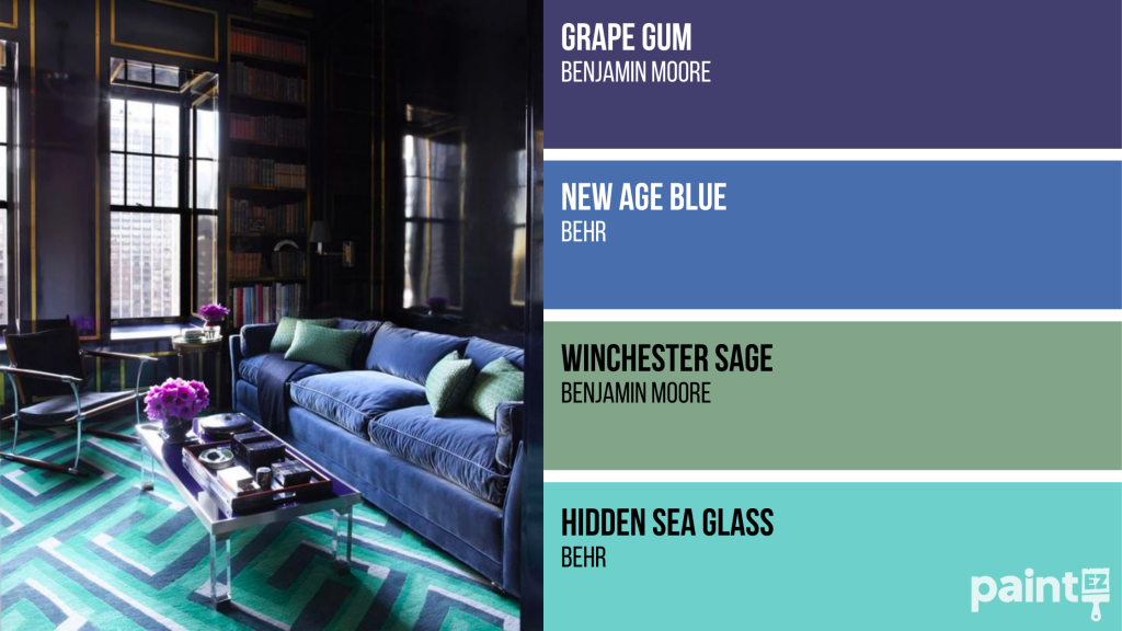
Very Peri + Blue & Green
Using aquatic tones with Very Peri is like a Mediterranean pick-me-up. When paired with blues and greens, the result is bold, refreshing, and packs an energetic punch that inspires and delights.
(Inspo Image Credit - Wildflower Pattern Purple and Pinks Wallpaper, Minehart
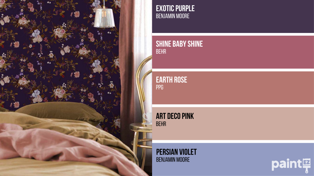
Very Peri + Pink & Peach
Thoughts of a calm tropical beach at dusk or a serene mountain dawn come to mind with this pairing of pinky and peachy shades with Very Peri, which will transform your space into an abode of creativity and rejuvenation. This combo brings a playful edge to an otherwise sophisticated color scheme that can be dressed up or down to suit your personal taste.
How To Incorporate Very Peri Into Your Home
Whether you’re redecorating an entire room or just looking to incorporate a few fresh features, here are some suggestions of how to use Very Peri in your space. All of these products were unbiasedly selected and not sponsored in any way for this post.
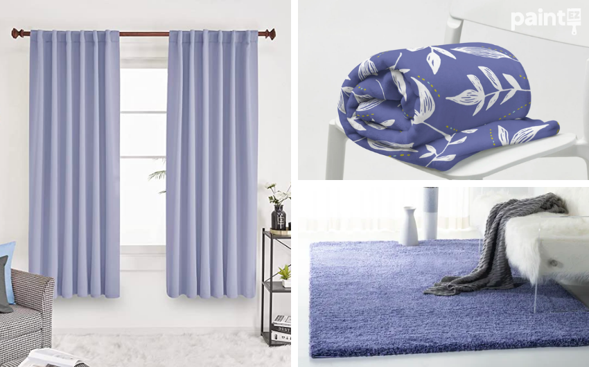
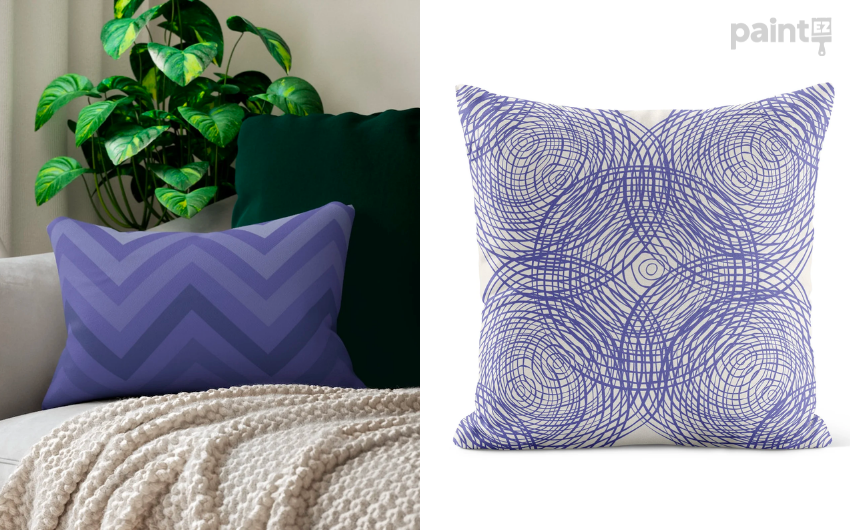
Cozy Textiles
Deconovo Room Darkening Curtains (Amazon)
Very Periwinkle Floral Throw Blanket (Etsy)
Dalkeith Periwinkle Area Rug (Wayfair)
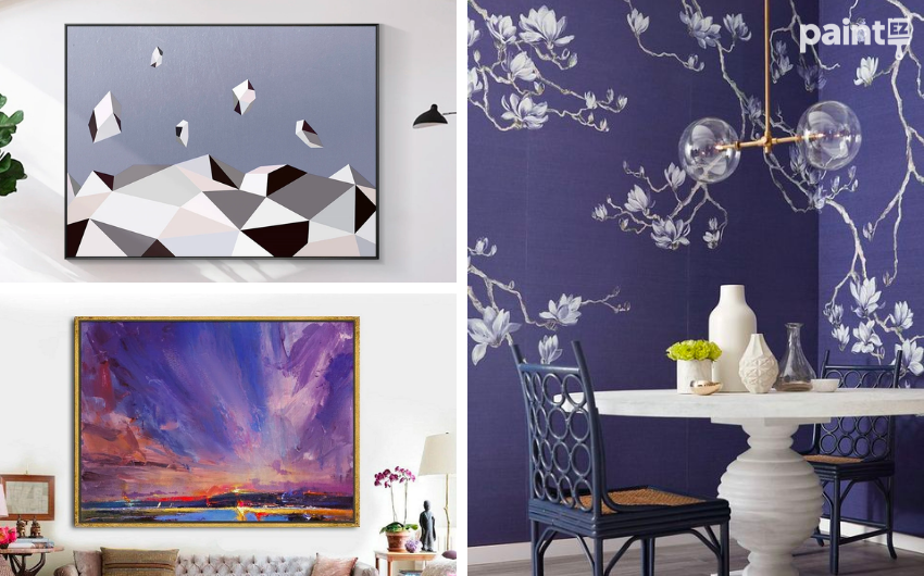
On The Walls
Zero Gravity Earth Canvas Painting (Etsy)
Original Painting Night View Of Coastline (Etsy)
Breakfast Nook Wallpaper (Color Soul Pinterest)
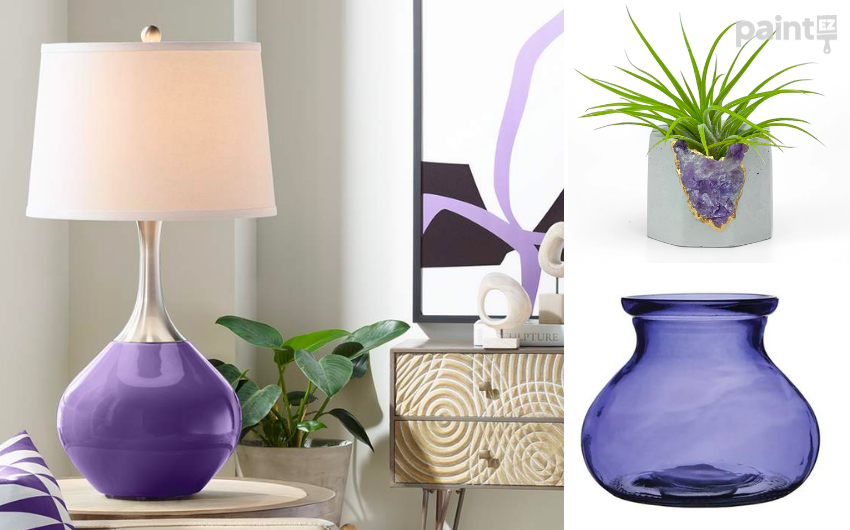
It’s All In The Details
Izmir Purple Spencer Table Lamp (Lamps Plus)
Raw Amethyst Crystal Planter (Etsy)
Rosie Posie Vase (Amazon)
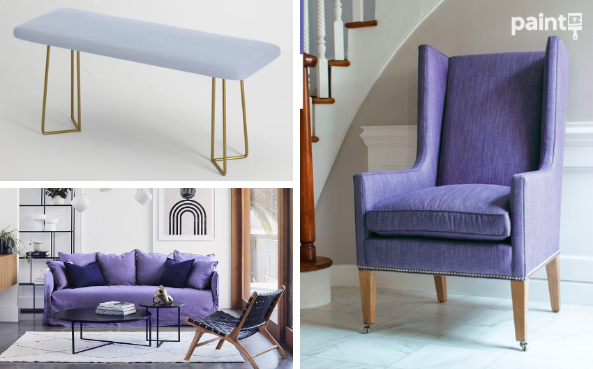
Somewhere To Sit
Crayon Box – Periwinkle Blue Bench (Society 6)
Special Edition Bronte Sofa (LoungeLovers)
Very Peri Armchair (Calico Pinterest)
Final Thoughts
2022 is all about transformation, and a great place to start is in the space where you spend so much of your time. Let Very Peri transport you to a state of zen to combat Zoom Fatigue by grabbing some new pillows or painting the walls.
Ready to paint? Schedule a free quote today with Paint EZ to get started.

