 Skip to content
How to Choose Exterior Paint Colors That Work With Brick, Stone, and Roofing
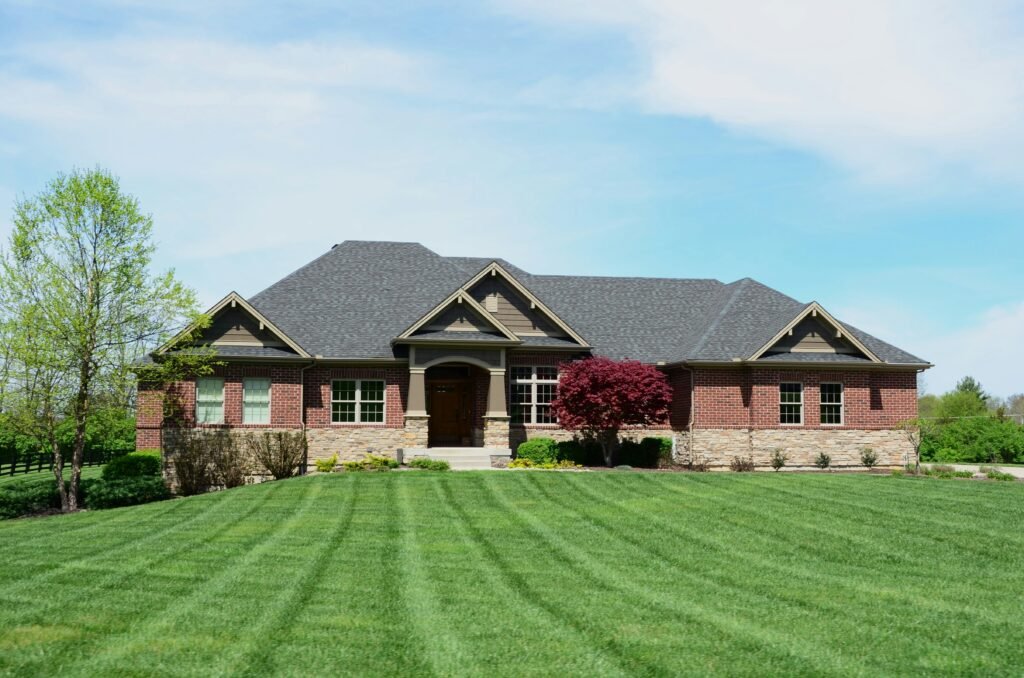
Choosing a new exterior paint color can feel surprisingly complicated. A color may look beautiful on a sample card or another home but appear completely different beside your brick, stone, roofing, or landscaping.
That is because an exterior color does not stand alone. It becomes part of a larger palette that includes materials you may not be changing.
The most reliable way to choose exterior paint colors is to begin with the permanent elements of your home. Identify whether the brick, stone, and roof lean warm or cool, select a body color that coordinates with those undertones, and then add trim and accent colors to create the right amount of contrast.
Starting with the home’s fixed materials gives you a much clearer direction than beginning with hundreds of unrelated paint chips.
What should you consider before choosing an exterior paint color?
Before looking at paint colors, identify which parts of the exterior will remain unchanged. These may include the roof, brick, stone, masonry, natural wood, windows, gutters, garage door, or other factory-finished materials.
These permanent features should form the foundation of your exterior color palette. Benjamin Moore similarly recommends taking color direction from unchanging elements such as roofing, stone, brick, and landscaping.
Look at the entire house from the street and ask which material carries the most visual weight. On one home, it might be a large red brick facade. On another, it may be a multicolored stone entrance or a highly visible roof.
The new paint should help these materials feel connected. It does not need to match them exactly. In fact, trying to match brick or stone too closely can make the exterior appear flat. The goal is to find related undertones that make the different materials look intentional together.
How do undertones affect exterior paint colors?
Every neutral paint color has undertones. White may lean yellow, pink, gray, blue, or green. Gray can appear warm and beige-like or cool and blue. Beige may contain gold, pink, green, or taupe undertones.
Brick, stone, and roofing also contain undertones. A brick facade that looks generally red from the street might include rust, burgundy, brown, cream, charcoal, or violet. Stone may contain several warm and cool tones at once.
If the undertones of the paint and permanent materials disagree, the combination can feel slightly wrong even when the homeowner cannot identify why. A cool blue-gray siding color, for example, may look disconnected beside strongly orange brick. A bright white with a cool undertone may make warm stone appear more yellow.
Sherwin-Williams explains that warm materials such as brick and gold generally coordinate more naturally with warmer beige-based undertones, while cooler stone can work well with cooler grays.
Undertones do not always need to match perfectly, but they should have a clear relationship. Deliberate contrast can be beautiful. Accidental conflict usually is not.
What exterior paint colors work best with brick?
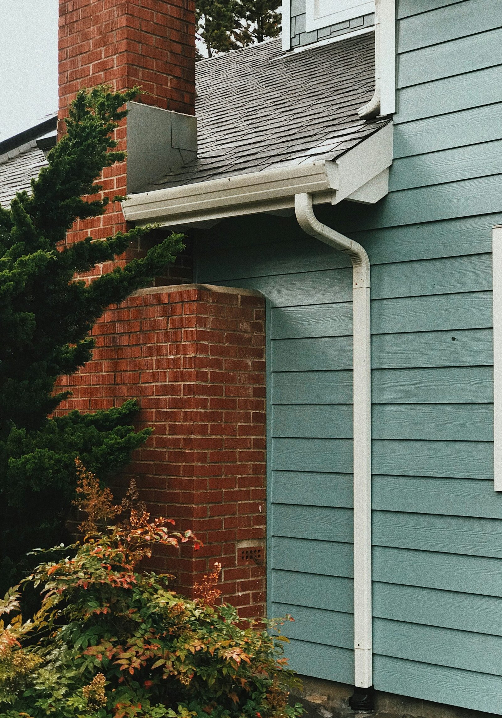
The best paint colors for a brick home depend on the colors already present in the brick. Instead of labeling the brick simply as red or brown, look closely at its full range of tones.
Stand several feet away and identify the dominant color. Then move closer and look for secondary colors in the individual bricks and mortar. These quieter colors often provide excellent inspiration for siding, trim, shutters, and doors.
Warm red or orange brick commonly coordinates with creamy whites, warm taupes, muted greens, deep browns, and some blue-green shades. Brown brick may pair well with warm beige, soft greige, olive, cream, or a restrained charcoal. Brick with burgundy or violet undertones can work with complex taupes, smoky blues, and gray-green colors.
Better Homes & Gardens recommends using materials such as brick and stone as inspiration for the exterior palette instead of treating them as separate design features. Its guidance on exterior colors for resale also suggests keeping the overall palette cohesive rather than introducing too many competing colors.
Avoid selecting a paint color that almost matches the brick but misses its undertone. A near match can make both surfaces look faded or muddy. Creating a noticeable difference between the painted surface and brick is often more successful.
If you are considering changing the appearance of the brick itself, first compare the visual and maintenance differences between limewash, whitewash, and other masonry finishes. Painting, limewashing, and whitewashing brick create different results and should not be treated as interchangeable options.
How do you coordinate exterior paint with stone?
Natural and manufactured stone typically contain more color variation than homeowners initially realize. One stone facade may combine cream, gray, gold, brown, charcoal, and even muted green.
Choose two or three recurring colors from the stone and compare paint samples to those tones. Usually, one of the quieter background colors will provide the best direction for the main body of the home.
If the stone is warm and earthy, consider warm whites, soft beige, taupe, muted olive, or complex greige. If it contains cooler slate or blue-gray tones, cooler gray, softened white, blue-gray, or deep green may feel more connected.
Benjamin Moore’s exterior guidance gives a similar example, suggesting that cool slate-colored stone can coordinate with darker greens, while warmer brick may pair more naturally with softer, warmer green shades.
The scale of the stone also matters. If stone covers a large portion of the facade, a quieter siding color may keep the exterior balanced. If it appears only around the entryway or foundation, the siding can carry more contrast without competing for attention.
Do not choose an exact imitation of the stone’s dominant color. A slightly lighter or darker related shade helps the stone remain an architectural feature rather than blending into one continuous surface.
How should your roof affect your exterior paint choice?
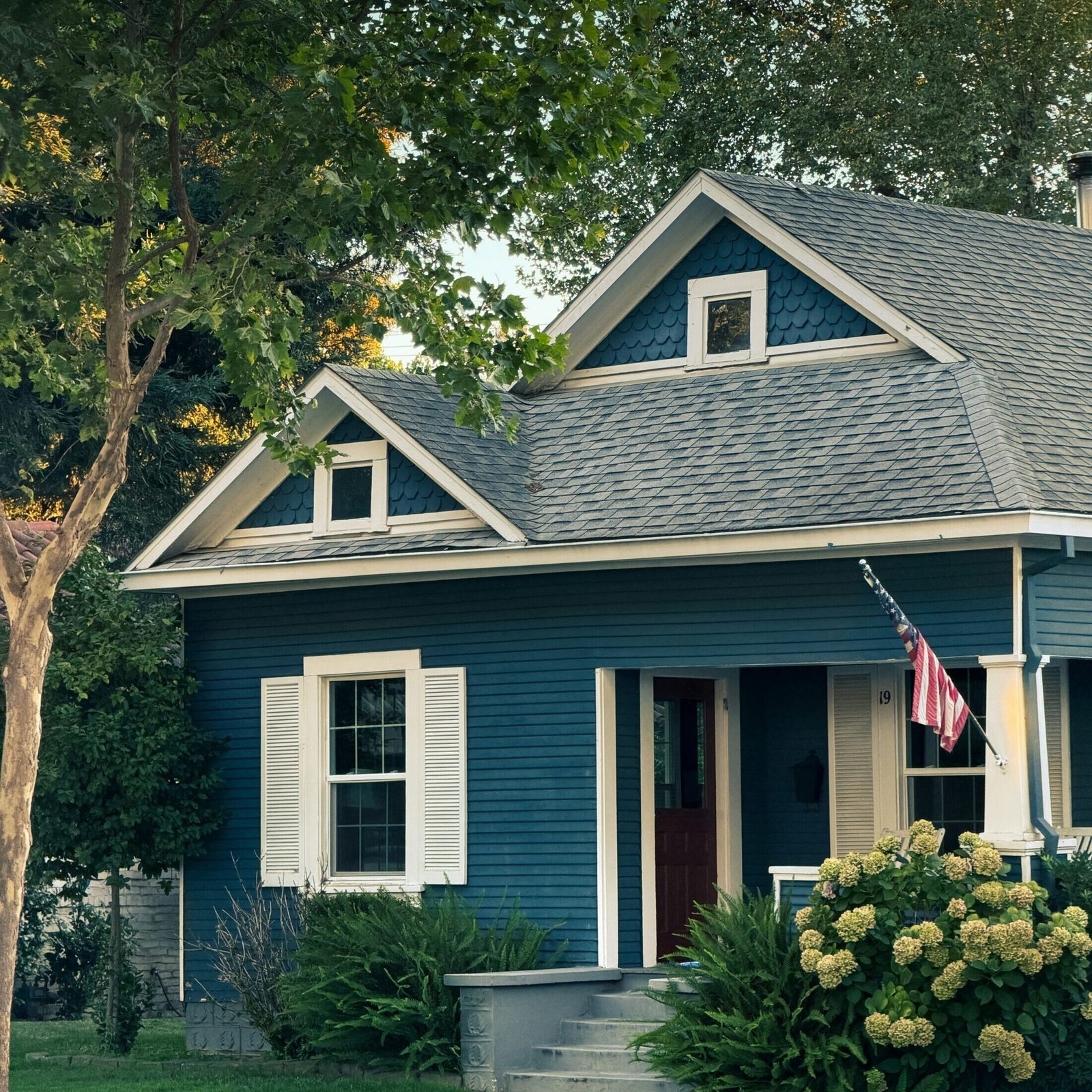
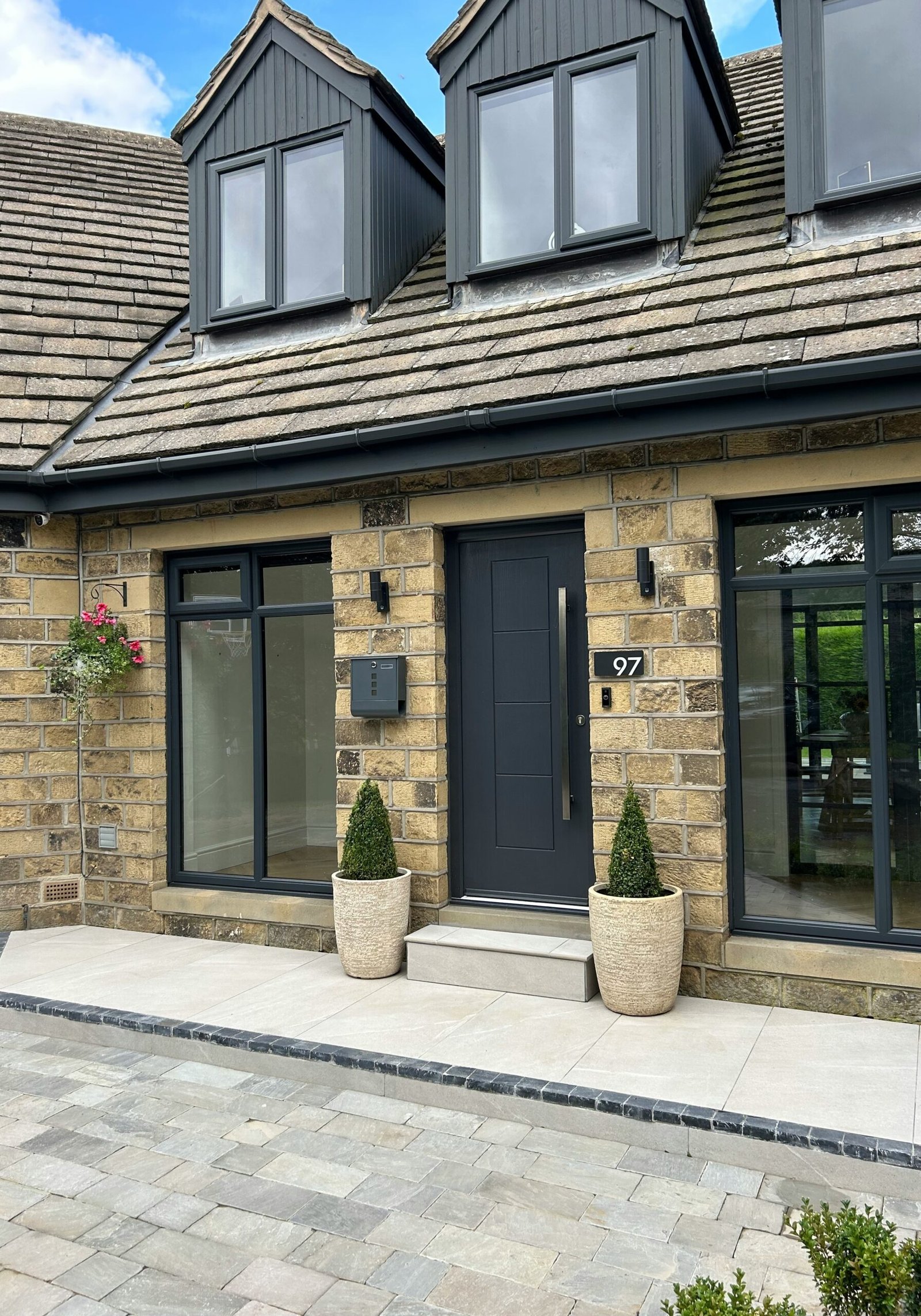
The roof is one of the largest permanent color areas on many homes, but it is often overlooked during paint selection. Even when the roof is not highly visible from the street, its undertones can influence the entire palette.
Begin by determining whether the roof is warm, cool, or relatively neutral. Brown, tan, rust, and weathered wood shingles usually lean warm. Charcoal, slate, and blue-gray roofs tend to lean cool. Some roofing contains a mixture of both.
A charcoal roof offers considerable flexibility and can coordinate with warm white, cool gray, green, blue, taupe, and many deeper colors. Brown roofing usually feels most cohesive with cream, tan, warm greige, olive, muted green, or earthy colors. A roof with strong red or terracotta tones often works best with warm neutrals and restrained natural shades.
The roof and siding do not need to match. They do, however, need enough distinction to avoid appearing like one uninterrupted block of color. A medium-gray roof paired with medium-gray siding may feel flat unless the undertones and trim create separation.
If both the roof and siding are dark, use the trim, front door, stone, or wood accents to prevent the exterior from becoming visually heavy.
How many colors should a home exterior have?
Most exterior palettes work well with three primary color roles: the body color, the trim color, and an accent color.
The body color covers the largest painted areas. The trim defines windows, fascia, soffits, columns, and architectural details. The accent color adds personality to the front door, shutters, or another focal point.
Brick, stone, roofing, and natural wood also count as colors within the overall composition, even though they are not being painted. A home with multicolored brick and stone may already contain enough variation and require only two painted colors. A simpler home without masonry might benefit from a more layered three-color palette.
Better Homes & Gardens notes that exterior color can be used to highlight architectural details and reinforce the home’s style. The key is deciding which features deserve attention.
Too many contrasting colors can divide the facade into disconnected sections. Too little contrast can hide craftsmanship and make the home appear flat. A successful palette creates hierarchy by allowing one color to lead while the others support it.
Should exterior trim always be white?
White is a classic trim choice, but it is not automatically the best choice for every exterior. The wrong white can clash with warm brick, creamy stone, or beige siding.
Bright, cool whites create crisp contrast and often suit modern homes, cool gray palettes, or exteriors with clean black accents. Creamy whites and softened off-whites generally coordinate better with warm brick, natural stone, brown roofing, and traditional architecture.
Trim can also be painted a deeper version of the siding color for a lower-contrast look. Some homes benefit from taupe, charcoal, green, or brown trim that connects to the roof or masonry.
For a modern color-drenched appearance, the siding and trim can be painted the same color or closely related shades. This approach reduces visual breaks and emphasizes the overall shape of the house.
The correct amount of contrast depends on the architecture. Decorative Victorian trim may benefit from definition, while a contemporary home with simple lines may look more cohesive with minimal contrast.
How should architectural style influence exterior color?
Your home’s architecture provides useful boundaries for color selection. It does not mean you must recreate a historically exact palette, but the colors should make sense with the structure.
Traditional Colonials commonly look balanced with classic body colors, defined trim, and a strong front-door accent. Craftsman homes tend to suit earthy greens, browns, muted blues, and warm neutrals that complement stone and wood. Tudor homes often feature cream, taupe, brown, and restrained accent colors that work with brick, stone, and dark timber details. Modern homes can support simplified palettes, darker colors, and lower-contrast trim.
Sherwin-Williams offers regional and architectural exterior color schemes based on styles ranging from historic homes to desert and coastal properties. These collections can be useful starting points, but the final colors must still be evaluated against your home’s actual materials.
The surrounding neighborhood also matters. Your house does not need to match the homes beside it, but it should relate to its setting. Homeowners associations and historic districts may also have color restrictions that should be reviewed before making a final selection.
Do exterior colors look lighter or darker outside?
Exterior colors often appear lighter, brighter, or less saturated in direct sunlight than they do on a small indoor sample. Shade, cloud cover, reflected landscaping, and the direction the house faces can also change the appearance throughout the day.
A color that looks warm in morning light may appear cooler in the afternoon. White can become extremely bright on a sunny facade, while a subtle neutral may lose much of its depth from the street.
This is why a digital rendering or paint chip should be treated as a narrowing tool rather than the final test. Benjamin Moore recommends viewing paint samples in different lighting throughout the day because sunlight and the home’s orientation affect how color is perceived.
Place samples beside the brick, stone, roofline, trim, and other important features. View them from the street as well as up close. Exterior color is experienced at a much larger scale than interior wall color, so a tiny chip cannot show the full effect.
What exterior color mistakes should homeowners avoid?
One common mistake is choosing the body color first and trying to make the permanent materials fit afterward. Beginning with the roof, brick, and stone provides a more dependable framework.
Another mistake is assuming all whites, grays, or beiges are interchangeable. Their undertones can create very different relationships with masonry and roofing.
Homeowners should also be careful when making dramatic color changes to vinyl siding. Some darker colors can absorb more heat than the siding was designed to tolerate. Sherwin-Williams offers a collection of VinylSafe exterior colors formulated to reduce the risk of warping or buckling on suitable vinyl surfaces. Product and manufacturer requirements should always be confirmed before painting.
Finally, avoid selecting every feature as a focal point. Brick, stone, shutters, trim, doors, and siding cannot all compete equally. Decide what you want people to notice first and allow the rest of the palette to support it.
How can a professional color consultation help?
A professional color consultation can narrow a large selection of paint colors into a coordinated group based on your home’s existing materials, lighting, architecture, and surroundings.
The consultation may include identifying undertones, comparing trim options, evaluating accent colors, and creating renderings that help you visualize the finished exterior. Paint EZ offers color consultations and visualization support to help homeowners make decisions with greater confidence.
Once the colors are selected, proper preparation and application are equally important. The Paint EZ exterior painting process includes evaluating the home, preparing the surfaces, selecting appropriate products, and completing a detailed final walkthrough.
The goal is not simply to find an attractive paint color. It is to create an exterior palette that feels connected to the home, complements its permanent materials, and continues to look intentional over time.
Ready to choose a new exterior color?
Start by looking at what your home is already telling you. The brick, stone, roofing, architecture, and surrounding landscape contain valuable clues.
When those elements guide the color-selection process, the number of realistic choices becomes much more manageable. Instead of wondering which color looks best on a sample card, you can focus on which palette looks best on your specific home.
Contact your local Paint EZ team to schedule a free exterior painting quote and learn more about color consultation options in your area.